Dueemme Sidol
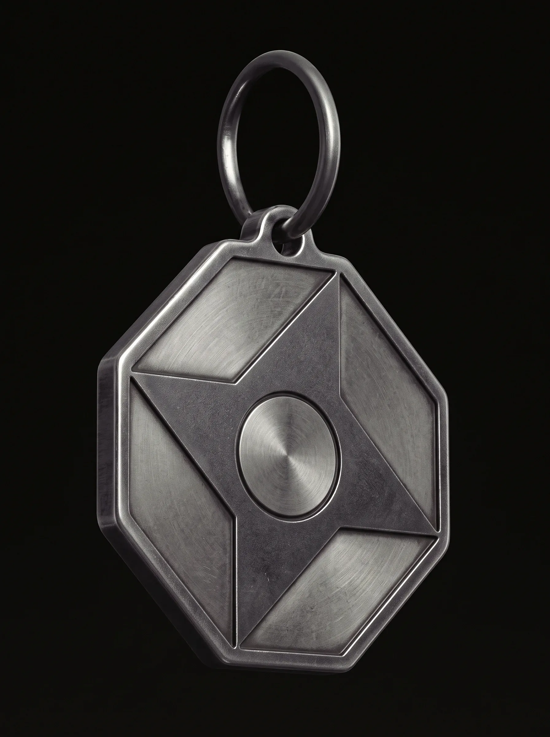
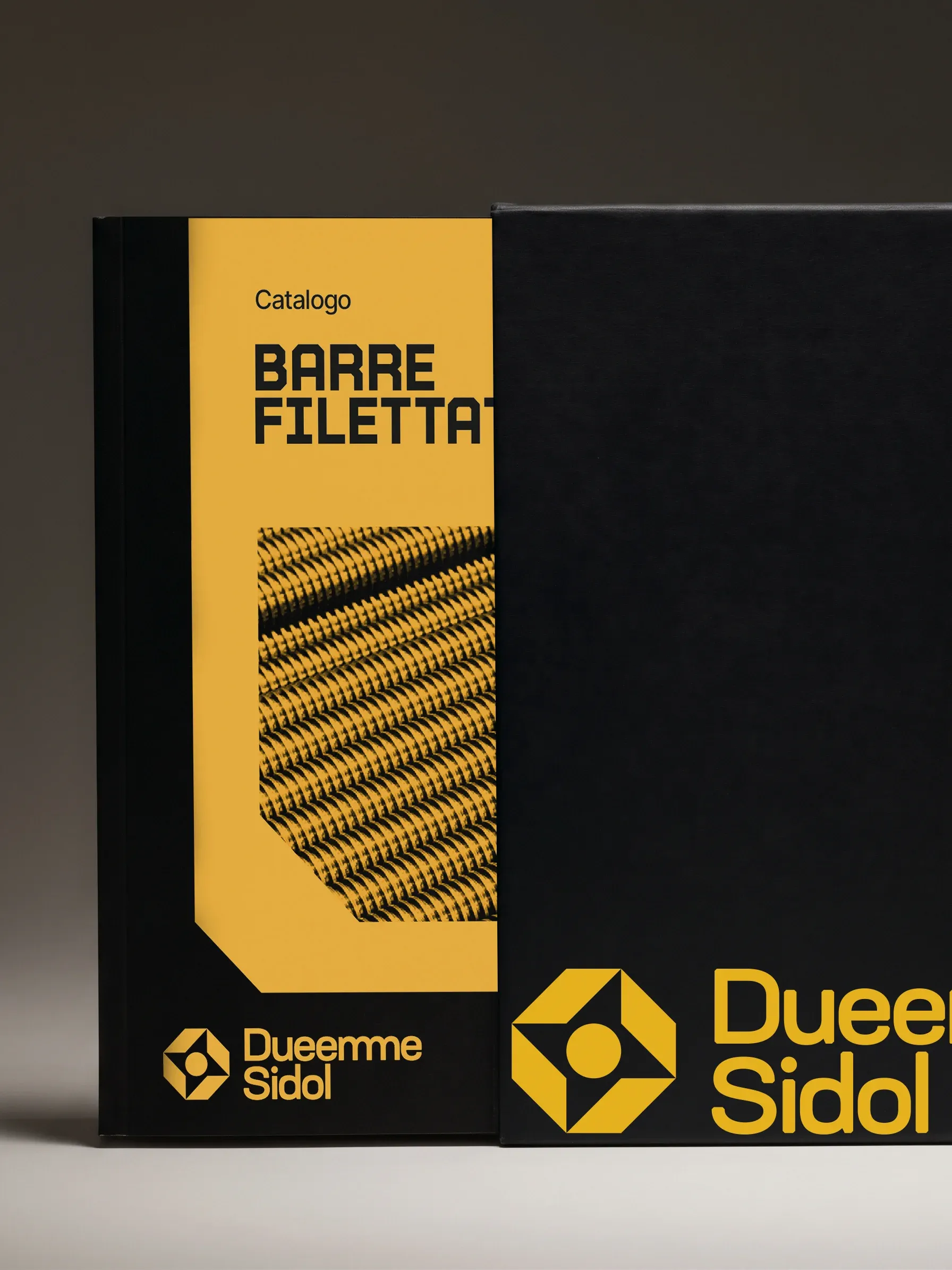
Rebranding of Dueemme Sidol, a spare parts distributor established in 1981 in Sesto San Giovanni, right in the heart of the Milanese “rust belt”. The symbol is clearly inspired by the head of a screw, paired with custom typography: the two “Ms” in the name are joined by a ligature, and the edges of the letters are customized to match the shape of the symbol itself.
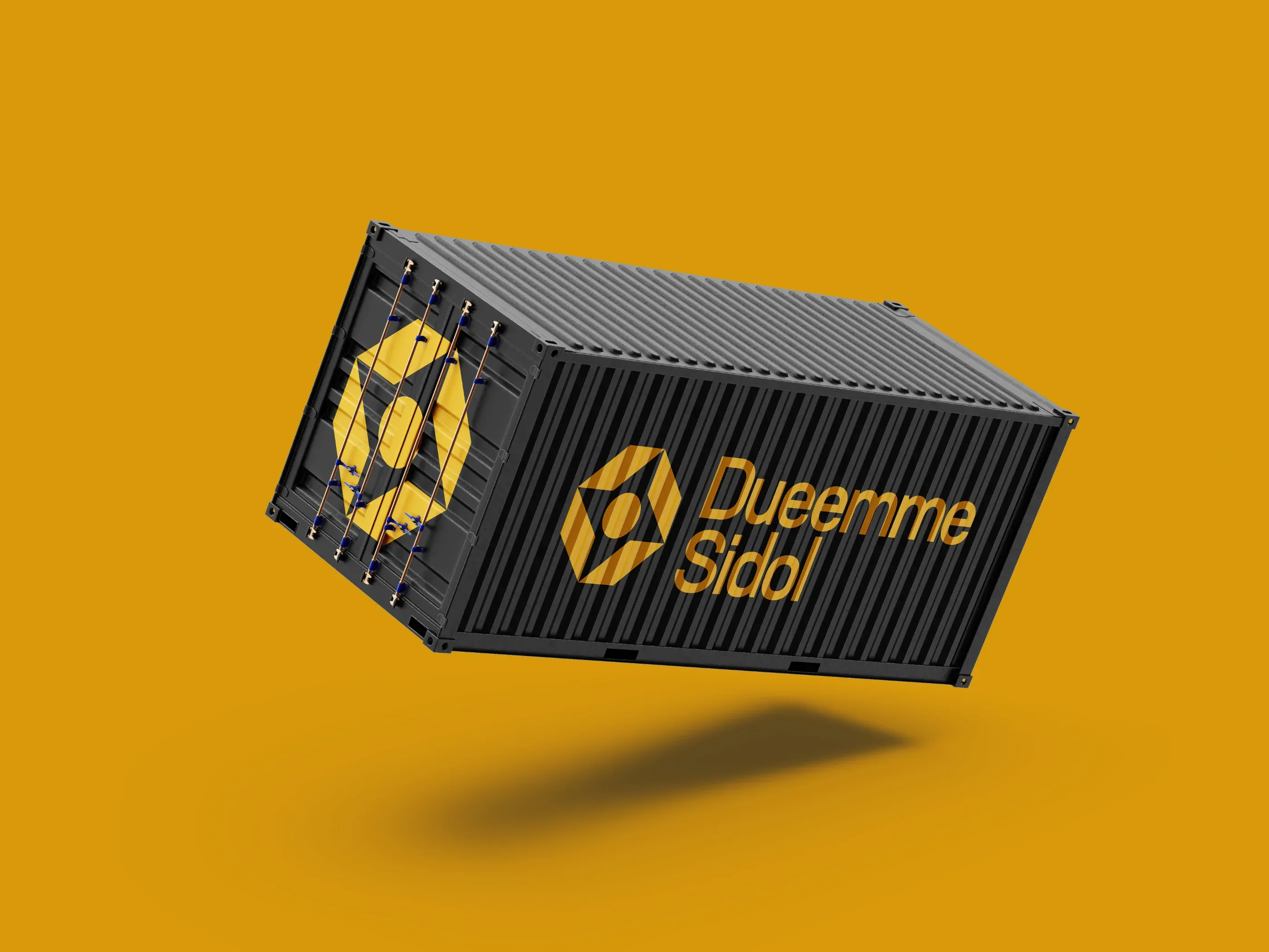
We chose yellow to resemble the tone of zinc plating, contrasting it with black to give the brand a bold, energetic, and captivating look.
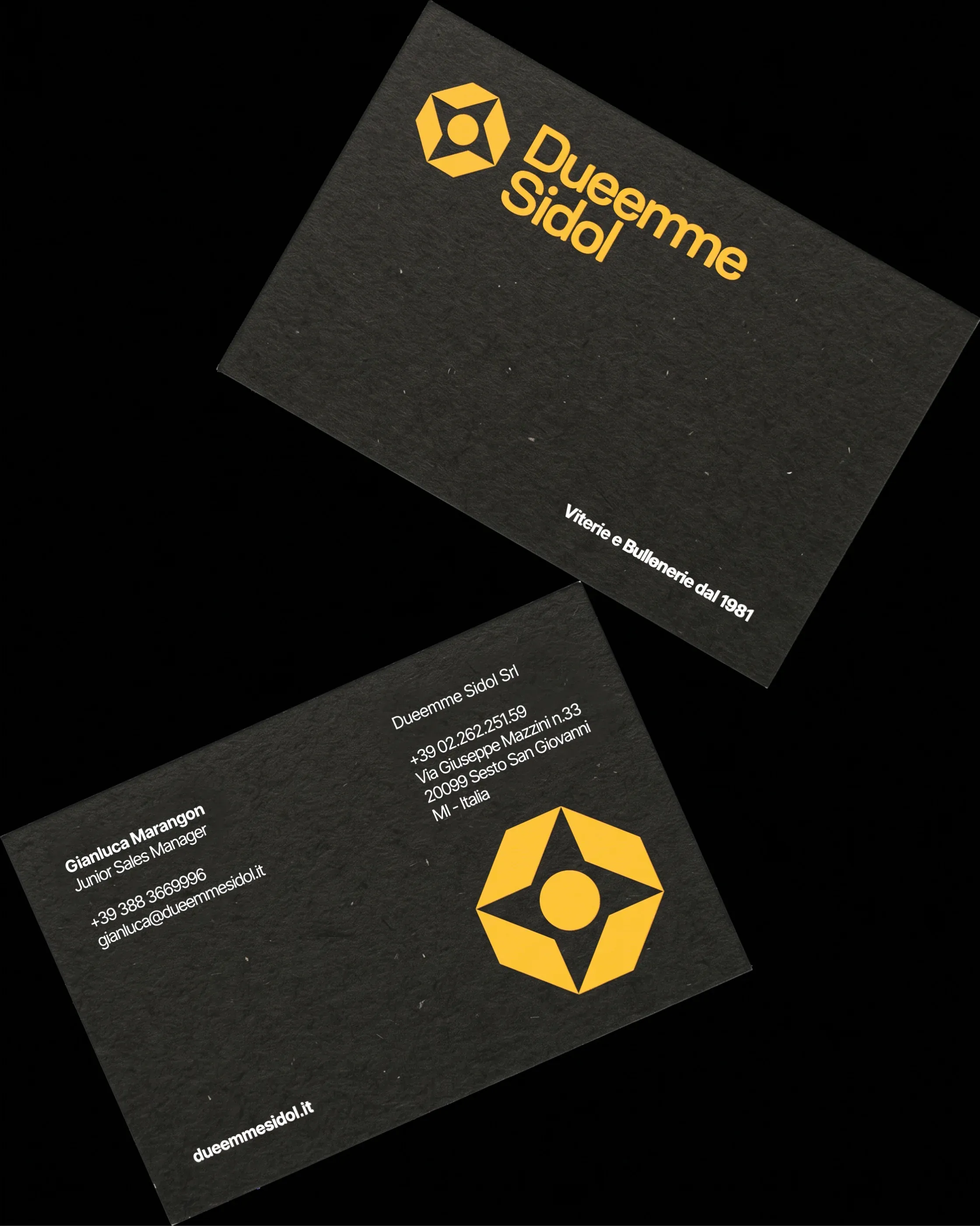
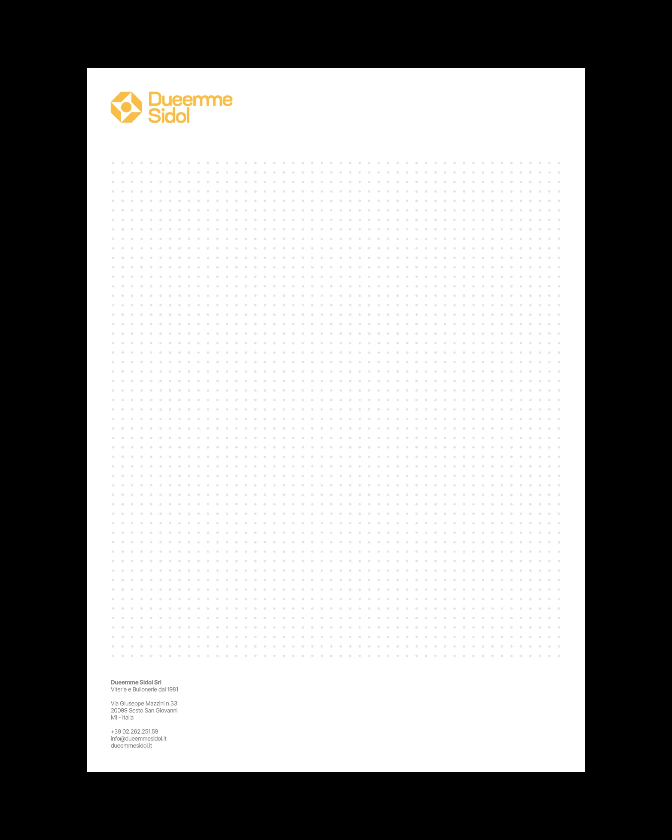
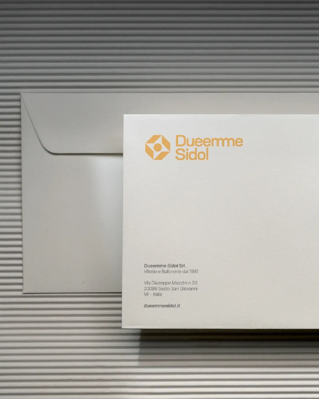
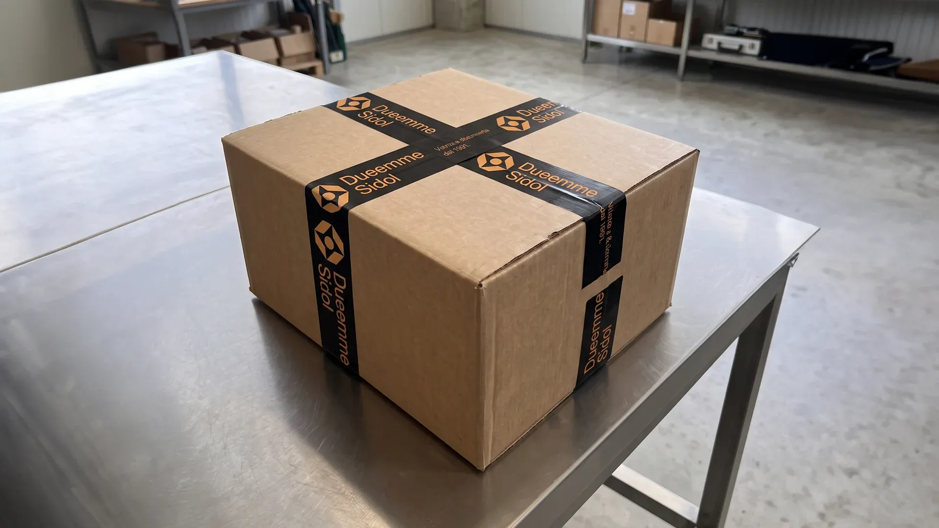
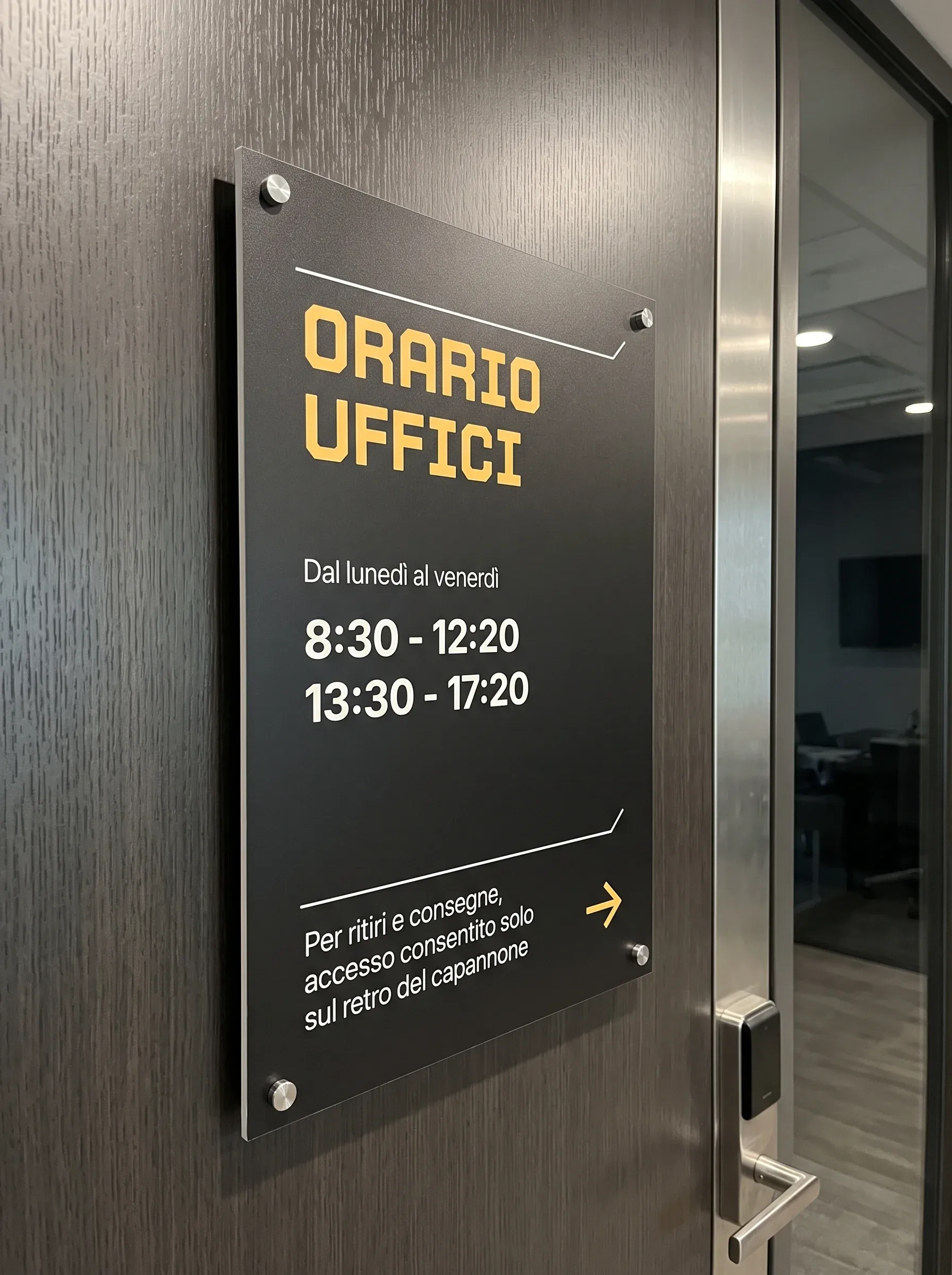
Along with the new branding, we designed their new signage, business cards, envelopes, notepads, and much more.